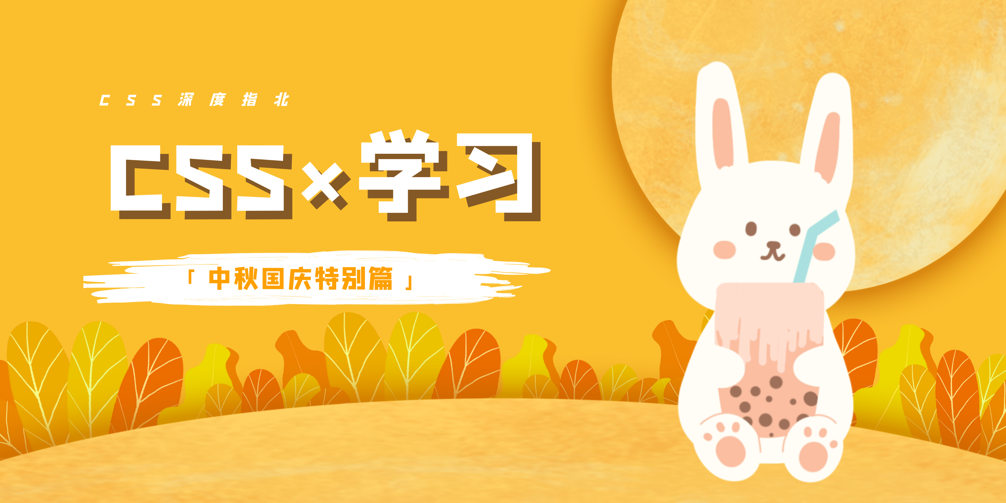
![]()
认识浏览器
组成部分
可能一说组成部分,小伙伴们就直接懵了,开门见山地说,别怕,还有更懵的在后面呢!
组成分为两大部分: shell 和 内核(其中内核是核心部分,它代表着浏览器所使用的技术手段,而shell就是我们用户所看到的界面)
例举你知道的比较大的浏览器产商?
| shell |
内核 |
| Google Chrome |
webkit(谷歌和苹果safari一起开发)/ blink(谷歌将技术独立出来) |
| safari |
webkit |
| firefox |
gecko |
| IE |
trident |
| opera(目前属于360和昆仑万维) |
presto |
===== 手动分界线 =====
分界线的意义:分界面下面部分只是在 shell 上做了手段,没有专属的内核。我们回答的话答分界线上部分即可。
内核
包含渲染(rendering)引擎 和 JS 引擎
渲染引擎如字面意思,就是渲染我们页面的,大致了解即可,本文在这里讲解一下 JS 引擎。 JS 引擎早期是不存在的,通过同步渲染引擎来负责JS的解析。而渲染引擎性能是有限的,所以JS解析代码能力就比较低,100行多代码可能就崩溃了。因此,引入了 JS 引擎,大大加大了对 JS 解析的优化,速度相当快。
比较有名的就是谷歌推出的 V8 引擎,针对 JS 解析做了非常多的优化。只能一句,谷歌,牛!
认识CSS
cascading style sheet (层叠样式表)
选择器
1
2
|
<div style="width: 100px; height: 100px;"></div>
|
1
2
3
4
5
6
7
8
| <style type="text/css">
div{
width: 100px;
height: 100px;
background-color: #000;
}
</style>
|
1
2
|
<link rel="stylesheet" href="./index.css">
|
权重优先级问题
查看如下代码,会显示什么颜色呢?
1
2
3
4
5
6
7
8
9
10
11
12
13
14
15
16
17
18
19
| <!DOCTYPE html>
<html lang="en">
<head>
<meta charset="UTF-8">
<meta name="viewport" content="width=device-width, initial-scale=1.0">
<title>CSS样式基础</title>
<link rel="stylesheet" href="./index.css">
<style type="text/css">
div{
background-color: blue;
}
</style>
</head>
<body>
<div style="background-color: red;"></div>
</body>
</html>
|
外部样式 index.css 文件代码如下:
1
2
3
4
5
| div{
width: 100px;
height: 100px;
background-color: yellow;
}
|
答案是 红色
权重:内联样式(用的较少,可以使用 display: none 缓存数据) > 内部样式表(一般测试用) > 外部样式表(主要使用方式)
选择器的优先级
!important > id > class | 属性 > 标签 > *
分组选择器
清除输入框的轮廓
1
2
3
4
| input,
textarea{
outline: none;
}
|
浏览器对父子选择器的匹配规则
从下到上,从右到左
1
2
3
4
5
6
| button{
border: none; // 去掉按钮的边框
color: white; // 更改按钮字体颜色
background-color: red; // 更改按钮颜色
font-size: 12px; // 更改字体大小
}
|
单行文本截断和显示省略号的三大件
1
2
3
4
5
6
7
8
| div{
width: 200px;
height: 22px;
border: 1px solid #000;
white-space: nowrap;
overflow: hidden;
text-overflow: ellipsis;
}
|
visibility:hidden 和 display:none 区别
visibility:hidden 保留被隐藏的元素所占据的HTML文档空间
display:none 不保留被隐藏的元素所占据的HTML文档空间
行内块和行内元素文本对齐问题
1
2
3
4
5
6
7
8
9
10
11
12
13
14
15
16
17
18
19
20
21
| <!DOCTYPE html>
<html lang="en">
<head>
<meta charset="UTF-8">
<meta name="viewport" content="width=device-width, initial-scale=1.0">
<title>行内块和行内元素文本对齐问题</title>
<style type="text/css">
.block{
display: inline-block;
width: 150px;
height: 100px;
border: 1px solid #000;
vertical-align: middle;
}
</style>
</head>
<body>
<span class="block">123</span>
<span>123</span>
</body>
</html>
|
![]()
容器内多行文本居中的方法
1、将容器的 display 设置为 table
2、将容器内的文本的 display 设置成 table-cell (表格单元格属性)
3、将容器内的文本的 vertical-aligin 设置成 middle
行内块元素之间默认间距问题
在产生边距的行内块的父元素设置属性:font-size:0px;
在父元素上设置,word-spacing(词边距)的值设为合适的负值即可
水平垂直居中:外盒子固定内边距,内盒子宽高100%
1
2
3
4
5
6
7
8
9
10
11
12
13
14
15
16
17
18
19
20
21
22
23
24
25
26
| <!DOCTYPE html>
<html lang="en">
<head>
<meta charset="UTF-8">
<meta name="viewport" content="width=device-width, initial-scale=1.0">
<title>水平垂直居中方式1</title>
<style type="text/css">
.box {
width: 100px;
height: 100px;
padding: 30px;
border: 1px solid #000;
}
.box .box1 {
width: 100%;
height: 100%;
background-color: orange;
}
</style>
</head>
<body>
<div class="box">
<div class="box1"></div>
</div>
</body>
</html>
|
![]()
浏览器body默认margin
ie8 -> 上下16px 左右8px
ie7 -> 上下15px 左右11px
定位
浮动流
浮动流,块级元素无法识别浮动流元素的位置。而定位 position 会新建一个图层。
内联、内联块、浮动、溢出隐藏、纯文本都可以识别浮动元素的位置,除了块级元素。
float以后,元素就变成内联块级元素
清除浮动方式1
因为设置了浮动流了之后,块级元素没办法识别浮动流元素的位置,自然会出现高度塌陷的问题。可采用如下方式清除,通过一个块级元素,设置 clear: both 即可,但此方法不是特别好,额外新增了一个元素。
1
2
3
4
5
6
7
8
9
10
11
12
13
14
15
16
17
18
19
20
21
22
23
24
25
26
27
28
29
30
31
32
33
34
35
36
37
38
39
| <!DOCTYPE html>
<html lang="en">
<head>
<meta charset="UTF-8">
<meta name="viewport" content="width=device-width, initial-scale=1.0">
<title>清除浮动方式1</title>
<style type="text/css">
.box {
width: 200px;
border: 1px solid #000;
}
.box .inner-box{
float: left;
width: 100px;
height: 100px;
}
.box .inner-box.box1{
background-color: green;
}
.box .inner-box.box2{
background-color: orange;
}
.clearfix{
clear: both;
}
</style>
</head>
<body>
<div class="box">
<div class="inner-box box1"></div>
<div class="inner-box box2"></div>
<p class="clearfix"></p>
</div>
</body>
</html>
|
![]()
伪类
直接看下面例子,看看伪类是怎么使用的
1
2
3
4
5
6
7
8
9
10
11
12
13
14
15
16
17
18
19
20
| <!DOCTYPE html>
<html lang="en">
<head>
<meta charset="UTF-8">
<meta name="viewport" content="width=device-width, initial-scale=1.0">
<title>伪类简单使用</title>
<style type="text/css">
p:before{
content: "Chocolate";
}
p:after{
content: "写博客!";
}
</style>
</head>
<body>
<p>喜欢</p>
</body>
</html>
|
其中, content 这个属性值必须加上!
![]()
清除浮动方式2
利用伪元素来清除浮动,通过添加一个块级并且设置 clear:both来清除。
1
2
3
4
5
6
7
8
9
10
11
12
13
14
15
16
17
18
19
20
21
22
23
24
25
26
27
28
29
30
31
32
33
34
35
36
37
38
39
40
41
42
43
44
45
46
47
| <!DOCTYPE html>
<html lang="en">
<head>
<meta charset="UTF-8">
<meta name="viewport" content="width=device-width, initial-scale=1.0">
<title>清除浮动方式2</title>
<style type="text/css">
ul::after,
div::after{
content: "";
display: block;
clear: both;
}
.box {
width: 200px;
border: 10px solid #000;
}
.box .inner-box{
float: left;
width: 100px;
height: 100px;
}
.box .inner-box.box1{
background-color: green;
}
.box .inner-box.box2{
background-color: orange;
}
</style>
</head>
<body>
<div class="box">
<div class="inner-box box1"></div>
<div class="inner-box box2"></div>
</div>
</body>
</html>
|
![]()
清除浮动方式3
下面才是清除浮动的最好方式,直接写一个类 clearfix,然后需要清除浮动的话,直接在父级元素上添加这个类就好了。
1
2
3
4
5
6
7
8
9
10
11
12
13
14
15
16
17
18
19
20
21
22
23
24
25
26
27
28
29
30
31
32
33
34
35
36
37
38
39
40
| <!DOCTYPE html>
<html lang="en">
<head>
<meta charset="UTF-8">
<meta name="viewport" content="width=device-width, initial-scale=1.0">
<title>清除浮动方式3</title>
<style type="text/css">
.clearfix::after{
content: "";
display: block;
clear: both;
}
.box {
width: 200px;
border: 10px solid #000;
}
.box .inner-box{
float: left;
width: 100px;
height: 100px;
}
.box .inner-box.box1{
background-color: green;
}
.box .inner-box.box2{
background-color: orange;
}
</style>
</head>
<body>
<div class="box clearfix">
<div class="inner-box box1"></div>
<div class="inner-box box2"></div>
</div>
</body>
</html>
|
![]()
content 实现动态数据
1
2
3
4
5
6
7
8
9
10
11
12
13
14
15
16
| <!DOCTYPE html>
<html lang="en">
<head>
<meta charset="UTF-8">
<meta name="viewport" content="width=device-width, initial-scale=1.0">
<title>content动态数据获取</title>
<style type="text/css">
p::before{
content: attr(data-username);
}
</style>
</head>
<body>
<p data-username="Chocolate">,欢迎您的来访!</p>
</body>
</html>
|
![]()
CSS3
盒子阴影
box-shadow:水平位置(必) 垂直位置(必)模糊距离 阴影的尺寸(相当于在水平和垂直上的一个增量) 阴影颜色 阴影的种类
兼容性写法
1
2
3
| -webkit-box-shadow: 0 0 10px;
-moz-box-shadow: 0 0 10px;
-o-box-shadow: 0 0 10px;
|
边框圆角
纯圆 50% 宽高一样
半圆角 height/2 + px
遇到图片突出覆盖问题,可以用 overflow: hidden 来解决。
网站cover背景图缩放不改变比例
1
2
3
4
5
6
7
8
9
| .banner{
width: 100%;
height: 600px;
background-color: orange;
background-image: url(img/xxx.jpg);
background-repeat: no-repeat;
background-size: cover;
background-position: center center;
}
|
背景图不随滚动条变化
background-attachment 有两个属性值, scrool(默认值,会跟随滚动条而变化),fixed(不会随着滚动条变化)
1
2
3
4
5
6
7
| html{
height: 100%;
background-color: orange;
background-image: url(img/xxx.jpg);
background-size: 100% 100%;
background-attachment: fixed;
}
|
logo公司常用写法模板
解决因为网络问题导致css加载不出来时有一个补救措施
1
2
3
4
5
6
7
8
9
10
11
12
13
14
15
16
17
18
19
20
21
22
23
24
25
26
27
28
29
30
31
32
33
34
| <!DOCTYPE html>
<html lang="en">
<head>
<meta charset="UTF-8">
<meta name="viewport" content="width=device-width, initial-scale=1.0">
<title>logo公司常用写法模板</title>
<style type="text/css">
h1{
margin: 0;
}
.logo{
width: 142px;
height: 58px;
}
.logo h1 .logo-hd{
display: block;
width: 142px;
height: 0;
padding-top: 58px;
background: url(img/logo.png) no-repeat 0 0/142px 58px;
overflow: hidden;
}
</style>
</head>
<body>
<div class="logo">
<h1>
<a href="" class="logo-hd">淘宝网</a>
</h1>
</div>
</body>
</html>
|
BFC特点
- 有点像完全独立出来的容器,不会对外面元素的布局产生影响。
- 属于普通流的范畴
如何让一个元素成为BFC
- body本身就是BFC元素
- 被定义float: left / right
- position: absolute / fixed
- display: inline-block / table-cell / flex
- overflow: auto / hidden / scroll
BFC解决了什么问题
它解决了什么问题?
- margin合并问题
- 高度塌陷问题
- margin塌陷问题
还是讲解一下 margin塌陷问题,如下代码,当我们在子级盒子里面设置 margin-top 发现会带着父级盒子一起下去了。
1
2
3
4
5
6
7
8
9
10
11
12
13
14
15
16
17
18
19
20
21
22
23
24
25
26
27
28
| <!DOCTYPE html>
<html lang="en">
<head>
<meta charset="UTF-8">
<meta name="viewport" content="width=device-width, initial-scale=1.0">
<title>BFC:margin塌陷问题</title>
<style type="text/css">
.box1{
width: 300px;
height: 300px;
background-color: #000;
}
.box2{
width: 50px;
height: 50px;
margin: 0 auto;
margin-top: 100px;
background-color: orange;
}
</style>
</head>
<body>
<div class="box1">
<div class="box2"></div>
</div>
</body>
</html>
|
![]()
解决方式,就是利用BFC特性
1
2
3
4
5
6
7
8
9
10
11
12
13
14
15
16
17
18
19
20
21
22
23
24
25
26
27
28
29
30
31
32
33
34
35
36
| <!DOCTYPE html>
<html lang="en">
<head>
<meta charset="UTF-8">
<meta name="viewport" content="width=device-width, initial-scale=1.0">
<title>BFC:margin塌陷问题</title>
<style type="text/css">
.box1{
width: 300px;
height: 300px;
background-color: #000;
}
.box2{
width: 50px;
height: 50px;
margin: 0 auto;
margin-top: 100px;
background-color: orange;
}
</style>
</head>
<body>
<div class="box1">
<div class="box2"></div>
</div>
</body>
</html>
|
CSS书写顺序
- 显示属性:display position float clear
- 自身属性:width height margin padding border background
- 文本属性:color font text-align vertical-aligin white-space
本文参考
全网最细最全的『CSS基础+进阶+实战』深度指南
感谢小野老师的对CSS的细致讲解,给老师打call,建议大家可以结合视频看一看,看完会恍然大悟的!
最后
文章产出不易,还望各位小伙伴们支持一波!
往期精选:
小狮子前端の笔记仓库
leetcode-javascript:LeetCode 力扣的 JavaScript 解题仓库,前端刷题路线(思维导图)
小伙伴们可以在Issues中提交自己的解题代码,🤝 欢迎Contributing,可打卡刷题,Give a ⭐️ if this project helped you!
访问超逸の博客,方便小伙伴阅读玩耍~
![]()


